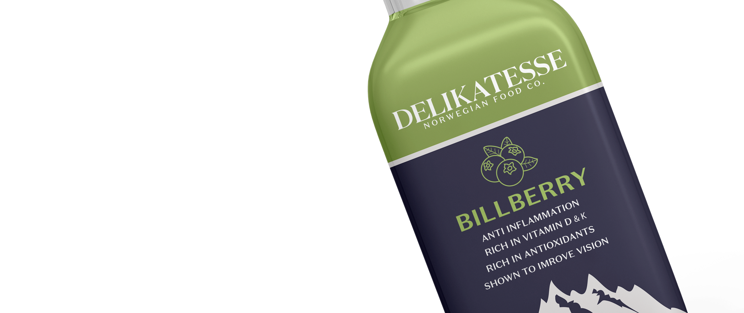
Delikatesse Bottle Designs
Background
A sweet branding project, and some juice bottle designs…awesome, right?! Below, we will delve into the brand, the products, and of course the designs.
Delikatesse & Goals
Delikatesse is a Norwegian food company that specializes in all natural but tasty juices. Being located in Norway, I wanted that very traditional Norwegian design trait of elegance to shine through.
Small Changes
Although this font was already such a great starting point, there were a few areas I had to adjust to get where I wanted it. The kerning needed extensive work (the spacing between each letter), and the spurs (piece that extends from the curve in a letter) and tails of the font were adjusted.
The Logo
When it came to the logo for this project, I chose to go with a typographic logo. With that said, choosing a font was the first test. I knew I wanted something serif to really give off those elegant vibes. In the end, I settled on a font from one of my favorite type artists of all time, Kris Sowersby from Klim Type Foundry. The font — Domaine.

Bottle Designs
After the logo was set, the next step was the juice bottles. Three were needed — apple, orange, and bilberry. Luckily, with my past experience working at a supplement store, I had a pretty good understanding of the benefits of these juices.
Initial Sketches
Usually, I’m a huge pencil and paper type person, and love to scribble to see what comes to mind. I find it incredibly freeing, and less restrictive than starting on the computer. For this project, however, one of my first few sketches really resonated with me, causing me to pretty much halt the sketching, and go right to the computer. Looking back, I’m incredibly happy I followed my instincts.


