Liquidpedia F1 Tracks
Liquidpedia is a Wikipedia for esports. This year, they reached out regarding their expansion into Formula One coverage. On the graphics side, the task was quite expansive; create a visually appealing but informative outline of each and every current F1 track being raced this year. Enjoy!
Gathering Intel
Within the realm of Formula One, the creation of a track layout is a balance of accuracy and visual appeal. It's essential to consider the viewer's perspective and strategically incorporate key elements into the design, all while staying accurate to the historical nature of each track. Every curve, straight, and chicane should not only adhere to that historical nature, but also resonate with viewers' emotions.
With that being said, I embarked on an extensive coffee filled night, and scoured the internet for various iterations and innovative visual approaches. My quest was to recognize what resonated not only with myself, but also with the passionate fan base of esports and Formula One. This exploratory phase forms a base for the creative process. Now, time for concepts.
First Iterations
During the concepting stage, we had many different ideas in mind of how to visually approach the tracks. Obviously, the layout of the track itself is set in stone. Figuring out the colors that work best, the thicknesses, smoothness, and factoring in light and dark modes was, however, a challenge.
The overarching goal was for the tracks to be visually appealing, colorful, but not too childlike, and easily understandable and identifiable from an avid F1 fan.
Closing In
After many different concepts were created, we settled in on a direction we were all very happy with, and fleshed out more of the creative needs from there.
The client made it clear they would need three separate versions of each track.
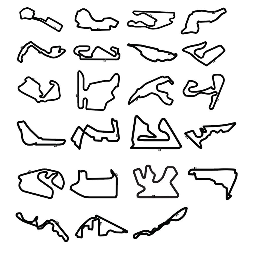
An all-black version of the track for thumbnail views. This shows the track itself, the start/finish line, and the DRS zones (drag reduction zones, or the go fast zones for you non-racers out there.)
A simplified version that showcases everything from the monochrome version, but with the addition of colors signifying the sectors on the track.
A detailed version that shows everything from the previous two, but includes corner numbers for those real detail-oriented fans to study every corner.
Final Assets
You get a track, and you get a track! Oprah jokes aside, there were a ton of tracks for this project. In the end, we are all incredibly satisfied with the result. Every corner, bend, straight — all completely accurate to the real life layouts. Simultaneously, the colors pop, and allow the vital details to be quickly and easily digestible by F1 fans at a quick glance.

All Monochrome Circuits
Albert Park Circuit
Bahrain International Circuit
Baku City Circuit
Circuit de Barcelona-Catalunya
Circuit Gilles-Villeneuve
Circuit of the Americas
Hungaroring
Autodromo Internazionale Enzo e Dino Ferrari
Autódromo José Carlos Pace
Jeddah Corniche Circuit
Lusail International Circuit
Marina Bay Street Circuit
Autódromo Hermanos Rodríguez
Miami International Autodrome
Circuit de Monaco
Autodromo Nazionale Monza
Red Bull Ring
Suzuka International Racing Course
Silverstone Circuit
Circuit de Spa-Francorchamps
Yas Marina Circuit
Circuit Zandvoort


